How we made our beer matchmaker
March 29, 2014
A few months ago, my colleague and fellow beer lover Chris Havens noticed an interesting fact: that Minnesota was among the nation’s leaders in craft brewery growth. Chris and I knew we had stumbled upon a great opportunity — we just didn’t know what it was.
Around the same time, FlowingData picked up on a great post on clustering 86 types of whiskey, which included a fantastic dataset that was begging to be visualized. I built a star plot generator in d3, which my future colleague Christopher Ingraham soon expanded into a beautiful visual representation of the whiskey. (Chris later found the source for the data — quite the tale.)
I showed Chris Havens, and we immediately saw the underpinnings for the graphic we finally published: Beer Me, Minnesota! With more than 50 breweries currently operating in Minnesota (and no indication of that trend soon reversing), we hoped to guide readers through the influx of local craft beer.
Build-your-own-dataset
Great data visualization requires great data, and no such set existed for attributes of local craft beer. To ease compilation of the information, Chris and I built a Google Form to send to local brewers. We weren’t initially sure what we would be doing with the data, but many brewers were trusting enough to respond with information about their favorite brews. We had to be a bit cautious in forming questions, though, since the data would be self-reported by the brewers.
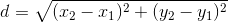
The math behind the matchmaker
Our matchmaker is surprisingly simple mathematically. When the user searches, the code uses a version of the distance formula to find the closest match.
In a two-dimensional world, the distance between two points is:
distance
It’s easy to expand the distance formula to a generic world of n
dimensions:

distance-n
Of course, our beer world had five dimensions: IBUs, SRM, Aroma, ABV, and Body. Since these attributes had different ranges, we first had to normalize them. Otherwise, a 10-point difference in IBUs would mask a 0.10 difference in ABV, though the latter is more substantial.
The mathematics in JavaScript:
// Distances will be saved in a two-dimensional array. The first
// dimension will be the source node, and the second will be the
// destination. The value will be the distance between them.
var distances = [];
_.each(normalized, function(src) {
  distances[src.i] = [];
  _.each(normalized, function(dst) {
    distances[src.i][dst.i] = Math.sqrt(
      Math.pow((src.n_abv - dst.n_abv) / 100, 2) +
      Math.pow((src.n_ibu - dst.n_ibu) / 100, 2) +
      Math.pow((src.n_body - dst.n_body) / 100, 2) +
      Math.pow((src.n_aroma - dst.n_aroma) / 100, 2) +
      Math.pow((src.n_srm - dst.n_srm) / 100, 2)
    );
  });
});
Visualizing the data was simple with
d3.starPlot(), which I refined
over the course of the project. To introduce readers to this type of chart, we
live-visualized their attribute choices. On slider change, I called the
following function:
function updateCustomChart() {
  innerChart
    .datum({
      abv: customVal.abv,
      srm: customVal.srm,
      ibu: customVal.ibu,
      body: customVal.body,
      aroma: customVal.aroma
    })
    .call(customStar)

  innerChart.selectAll('.star-path')
    .style('fill', function(d) {
      return srmColor(d.srm);
    });
}
It’s pretty simple, but to fun (and surprisingly helpful) effect. I leave building a national version as an exercise for the reader.